How To Use the Map
The AirNow Fire and Smoke Map provides information that you can use to help protect your health from wildfire smoke. Use this map to see:
- Current particle pollution air quality information for your location,
- Fire locations and smoke plumes,
- Smoke Forecast Outlooks, where available; and,
- Recommendations for actions to take to protect yourself from smoke. These recommendations were developed by EPA scientists who are experts in air quality and health.
To learn how to use this map, see:
- How do I find the air quality near me?
- What am I looking at on the map?
How do I find the air quality near me?
To find the air quality near you (or another location of interest), you can allow the map to automatically center on your geolocation, search on a location name, or simply pan and zoom the map to the spot you are interested in.
Once there, you will see circles of various sizes (indicating different types of particle pollution measuring devices) that display colors from the Air Quality Index (AQI). The colors indicate the AQI category of the particle pollution measured at these locations:
To learn more about the Air Quality Index and what the categories mean and how to protect yourself, see the AQI Basics page and the Wildfire Guide Factsheets.
To learn more about what you can see on the map look below.
What am I looking at on the map?
This version of the Fire and Smoke Map features icons indicating air quality measurements, fires, and more. The icons on the map are clickable, so you can learn more about smoke pollution in your area and steps you can take to do to reduce your smoke exposure.
Air quality icons on the map. All of the air quality icons are circles. The size of the circles indicates the type of device that is reporting fine particle pollution, the key pollutant in smoke.
|
Larger circles with numbers in them indicate permanent air quality monitors |

|
Medium-sized circles with the letter “T” in the middle indicate temporary air quality monitors |
|
Smaller circles with no letters or numbers in them indicate sensors. |
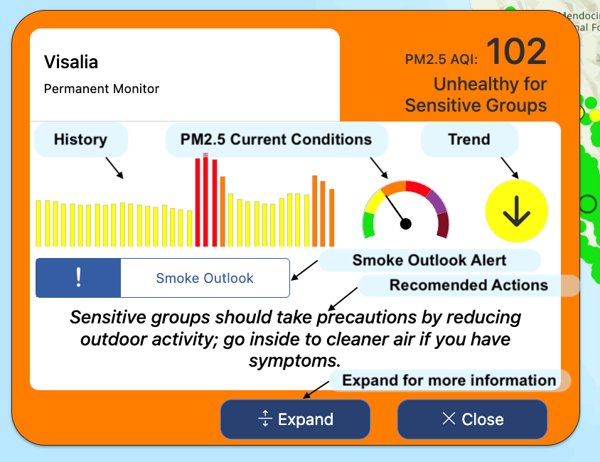
When you click any air quality icon, a box will open with additional information. You’ll see the current air quality, recommended actions to take to protect your health, the air quality history for the day, and a circle that shows whether the air is stable, improving, or getting worse -- all presented in a compact format. If a wildfire Smoke Outlook has been issued for the area, an alert will appear in the box, too.

Click the  button on the box to expand the box to see even more information.

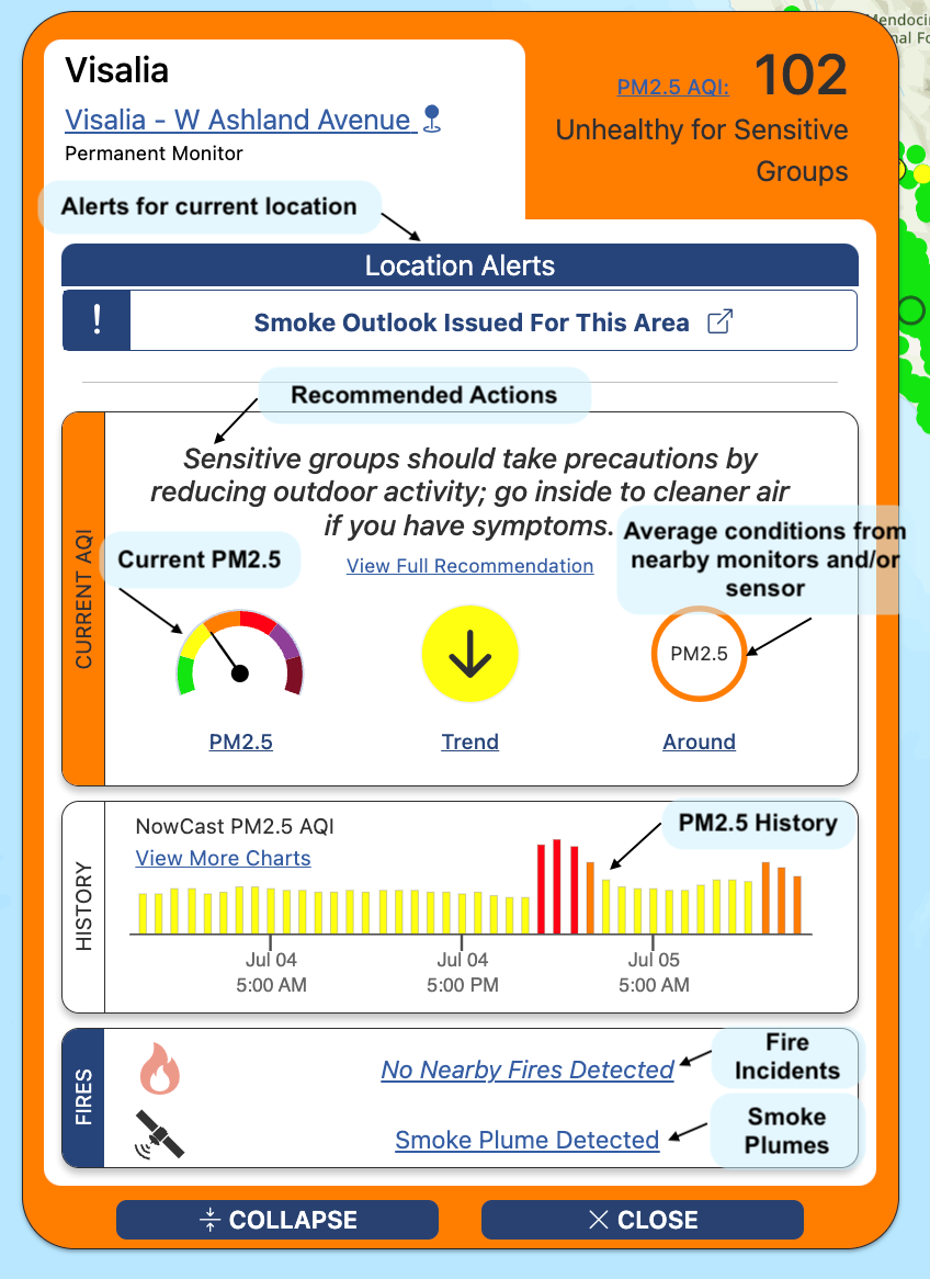
This expanded view contains more information and provides links to fuller explanations. Click on any aspect of the display to learn more about that item. Some of the information that is available here includes:
- A link to the Smoke Outlook for the area, if one has been issued. Smoke Outlooks are issued for large U.S. wildfires when air resource advisors have been assigned to the fires. The Outlooks are designed to help people understand possible smoke impacts for the next several days.
- A link to full activity recommendations for the current AQI category – and activity recommendations for all AQI categories.
- Alerts when ozone or coarse particle pollution (PM10) levels in your area are higher AQI category/ies than particle pollution levels, with links to additional information so you can take appropriate actions.
- More detail about recent air quality history at a monitor or sensor
- Information about other fires within 30 miles of the monitor or sensor location.
Fire icons. There are two types of fire icons on the map
![]() The flame icon indicates a “fire incident” that has been reported to the National Interagency Fire Center. A fire incident may be a wildfire or a prescribed fire. Click the flame icon to learn more about the fire. This will bring up some basic information about the fire and, where available, a link to the fire’s information on the national fire incident website, https://inciweb.wildfire.gov/.
The flame icon indicates a “fire incident” that has been reported to the National Interagency Fire Center. A fire incident may be a wildfire or a prescribed fire. Click the flame icon to learn more about the fire. This will bring up some basic information about the fire and, where available, a link to the fire’s information on the national fire incident website, https://inciweb.wildfire.gov/.
- When you zoom in, you may see the perimeter of the fire outlined in brown
- Sometimes, you may also see a box shaded in light blue around a fire incident, like this:
 . That means a Smoke Outlook has been issued for the area. Click on anywhere in the box for a link to learn more.
 A glowing circle indicates a fire that has been detected by satellites. Sometimes, multiple satellite-detected fires may be close together. When this happens, the icons may look something like this
 ![]() . You can zoom in and click a single glowing circle to find out the satellite that detected the fire and the date and time.
. You can zoom in and click a single glowing circle to find out the satellite that detected the fire and the date and time.
Location Icon ![]() . Entering a location makes more information available to you.
. Entering a location makes more information available to you.
If you did not select a location when you first got to the map, or want to change your location, you can click the location icon and type in your city, town, or ZIP code. The map will move to your location and show you information from nearby air quality monitors and air sensors when you click on a circle icon.
Note: If you are using the map on your phone, once you select your location, you can click the location icon to see the information from the nearby monitors and sensors first. Click the X at the upper right to close that panel and go back to the map.
Smoke Plumes. Where are the smoke plumes?
Smoke plumes do not automatically appear in this version of the map. It’s easy to turn them on; just click the settings icon ![]() on the upper right, and toggle on “NOAA Smoke Plumes.”
on the upper right, and toggle on “NOAA Smoke Plumes.”
Refreshing the map.
When you come back to the map after not using it for a while, the map will update when you interact with it. If you’re not sure if the map has updated, you can click the refresh arrow on the bottom right (it’s below the Legend button).


